
So yesterday we got a move on with our presentation on Walt Peregoy. So far we have the presentation in order with some side notes that will be developed today after class. This will help us know exactly what we’re going to say and also leave us with a few days to make changes and practice.
We’re using photographs for each slides of Walt’s work and going to discuss each in the 20 second-per-slide time limit. First we will introduce him and his background and possibly what/where he has worked. Then, we’ll talk about his main recognition of work for 101 Dalmatians and The Jungle Book for Walt Disney, then a little about Scooby Doo for Hanna Barbera, Sword in the Stone and finally talk about his own personal work and how it differs slightly compared to the concept work for films and TV.
Below is a ‘sneak peek’ I guess of some favourite slides from the Pecha Kucha.

I love this work of Walt’s for 101 Dalmatians because the amount of detail in each is so contrasting but still works really well. It’s clear to see from looking at the dogs (white boxes with lines) and also the environment differs with amount of detail. Nevertheless, the colour palette is still very much similar – cool tone browns and blues.
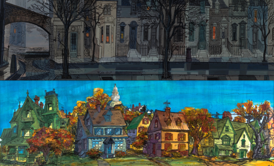
This is another interesting one as although it is drawn both of houses from 101 Dalmatians, the colours completely contrast each other and they look like different worlds! The style of the house is significantly different although the colour difference enhances the type of town and the people that may live there. Also the difference hints at the weather; possibly at different times of the year?
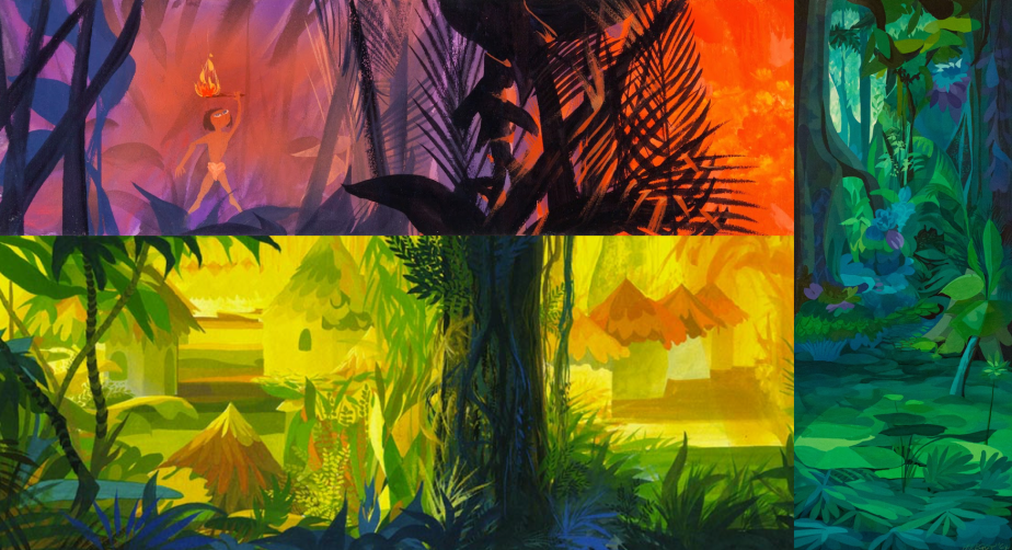
The above slide is from The Jungle Book. Again, the colour contrast of each image of Walt’s work could almost portray different times of the day; morning, mid-day and evening, as the sun rises and sets. The colour temperature changes the whole scene. You can also see the tonality in the paintings. This tells the story of where the light is coming from and if it’s in front or behind the foreground of the painting. All have a similar style of painting and it’s easy to pick out that each scene has a different colour palette – it seems that he used the shades of two colours only to create each. This is probably my favourite slide in terms of colour, it’s undoubtedly eye-catching.
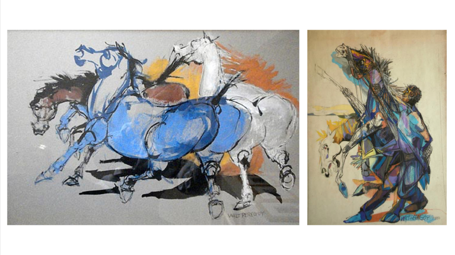
These are paintings of Walt’s personal paintings. The style differs visually from the concept work for films and TV programmes he has worked on. I was surprised at this because he is able to work in one style for his career, yet has a completely different personal style. It’s extremely colourful and seems he doesn’t really stick to one colour palette but uses any and every colour. The final pieces come across as they are not final but rather experimental work in a sketch book which is interesting and I think this is the beauty of his work; his finish pieces look unfinished. We also figured that he loves to draw horses in his spare time…
Before we were assigned this presentation, I wouldn’t have batted an eyelid at the name Walt Peregoy. However, after vaguely researching his fantastic work and looking at pieces that he has created, personal and from a career aspect, I’m so inspired. I feel like referring to his work, especially work from The Jungle Book, will help me with colour/tonality as this was something I really struggled with and was almost slightly scared to create anything using colour after learning the aspects and theory behind it.
